For my final shoot, I wanted to take my idea of toys further, but developing the idea of living toys. I came up with the idea of a person who isn't really a person. The way in which I achieved this was by taking the idea of Dali's work with the clock motif and using this as a part of the subject I would choose. My subject idea developed from inspiration that came from recent media, through the films 'Coraline' and Disney's 'Alice in Wonderland'. Both films (and their original respective books) are example of surrealist media. They capture an audience and take you on a journey that distorts reality; the main idea I wanted to portray through my final shoot.
I started off by choosing my subject. I chose to take photos of my grandmother because I think grandparents represent innocence and innocence is something I want to manipulate within my final images. I took a selection of portrait shots of her, which can be seen in the slideshow above. I asked her to remove her glasses for these shots because I was to focus on and edit her eyes for my final shots.
 The expression I wanted to show is that of a smile, because this can be seen as sinister depending on the surroundings. Because I had a variety of images to choose from and work on, I had the idea that it was best to combine two photos to create a more eerie result.
 |
| The Red Queen, Tim Burton's Alice In Wonderland, 2009. |
 |
| Other Mother, Coraline, 2009. |
I started off by choosing my subject. I chose to take photos of my grandmother because I think grandparents represent innocence and innocence is something I want to manipulate within my final images. I took a selection of portrait shots of her, which can be seen in the slideshow above. I asked her to remove her glasses for these shots because I was to focus on and edit her eyes for my final shots.
 The expression I wanted to show is that of a smile, because this can be seen as sinister depending on the surroundings. Because I had a variety of images to choose from and work on, I had the idea that it was best to combine two photos to create a more eerie result.
 To begin with, I chose the best photo I had of my grandmother's face to work from and add the surreal clock eyes. That was the image to the left. I wanted this final image to be heavily manipulated in order to separate it from reality, because the idea of surrealism as I have learnt from research is the distortion of reality.
 Therefore I carefully used the clone tool to enlarge her eye area in order to fit the clock eyes, seen below.
I then took away the two clocks from the shots I had taken in the second part of my shoot, in the slideshow above.

I used the eraser, feather, brightness and contrast tools to seamlessly fit the eyes into the photo. Also, I made one eye socket larger than the other to spread this idea of distortion. Although the eyes don't look natural, they were never going to look 100% natural because that is the idea of this theme.
Once I had finished placing the eyes in the photo, I then had to decide on the photo I would use as the main body of my subject. I wanted to make the body parts out of proportion, so my next decision was to make the head larger than the body. This decision came from looking over the photos Huet has created. His images seem to lie heavily on distortion of body parts and I think this is a good idea.

I chose the background photo because I feel it was the image with the best aperture. The aperture, again was something that I wanted to adjust further. This was achieved by taking a lasso selection of my grandmother in the foreground and copying it on to a new layer. I then used the blur tool to adjust the background and adjust the depth of field of the entire image.

I then pasted the selected head into the main photo, scaled it to the size I wanted, and used the eraser and feather tools again to incorporate the head into the new photo. I also fiddled with the light levels of the head so it fit into the full image. Because my photo was to be inspired by Dali and also other aspects of surrealism I've touched on, I thought that the background should also have aspects manipulated.
I used the layers to add a clock faintly to the outside window so it looks as though it is creeping in from behind the curtains. This was taken from the same clock as I photographed for the eyes, but at a different time (below).


I looked again at the work of Dali and decided that, much like the clocks his infamous painting, distortion of objects is key. I took the back of the chair, selected carefully around the object and scaled it to a larger size. I then used more of the tools to make it seem seamless which is the key to my piece. I need to make each part of the image work with the rest.


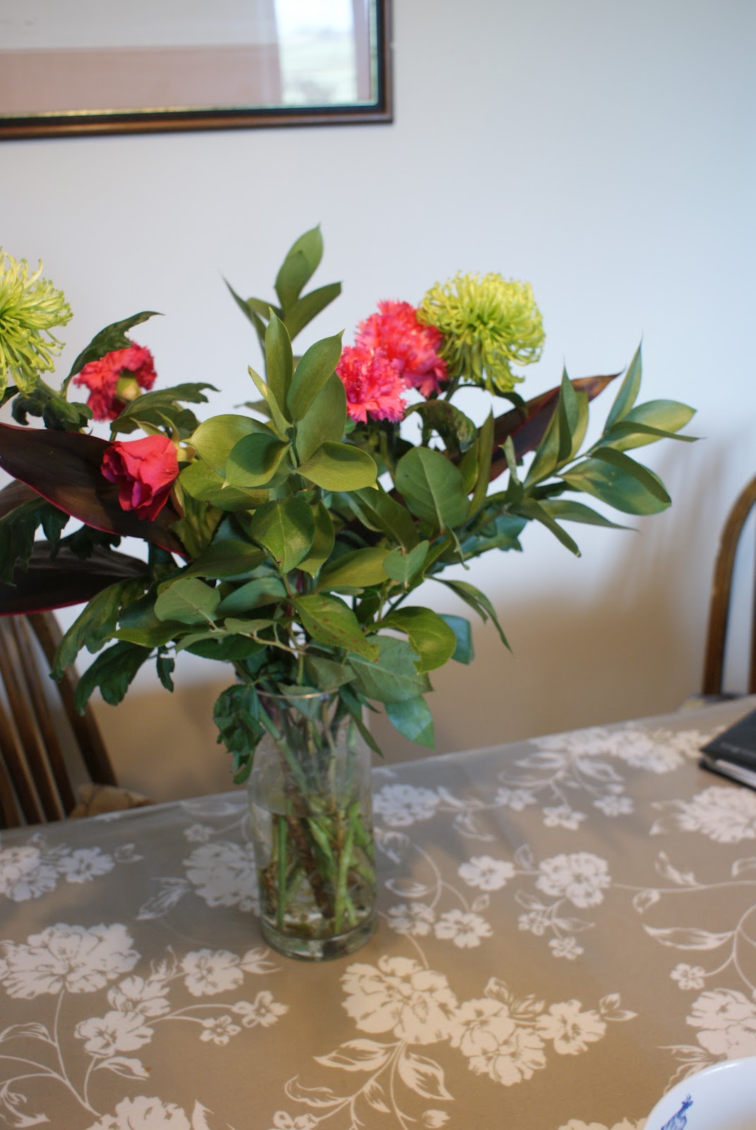
I wanted to develop this distortion idea further by choosing another background aspect. However, from what I had already taken, I didn't have anything else to manipulate in the background. So I decided to take a further few photos of flowers for the back of the room. These were taken against a similar light backdrop in order for removing it from one picture to another to be easier.
 I then roughly selected and copied the flowers from the photo and cleared any areas that had the previous background using the magic wand tool. I then used the distortion tool known as 'IWarp' to liquify the leaves so they droop in the Dali style, just like the clocks. To fit these flowers into the back I then had to use the Gaussian blur tool to set the depth of field the same. Finally I moved the flowers to the area in the photo that I thought they would look best.
I made sure that the flowers were on the level behind the chair so they didn't look out of place. I increased the size of the flowers because the manipulation of the flowers was what I wanted them for in the first place. The final thing to do was to adjust the colour levels of the image because I felt like it wasn't as vibrant as it needed to be to fit perfectly into this theme. This was done simply by increasing the temperature of the photo when the whole image was flattened to one layer.

My final image

I think my final image is really effective in meeting the brief of surrealism. The particular message I wanted to show through this image was that not everything is exactly as it seems. The friendly face of a grandmother can be deceptive because of the childhood innocence and the familiarity given off by the stereotype, and the surrounding area of the house. However, my final image gives an eerie twist to that.
Presenting my final image
To present my final image I needed to think of something quite different from the norm to reflect this surreal theme. I wanted to play on the idea of distortion which is what the original brief expresses and to frame the image quite boldly in a way that would make it quite striking, but at the same time I was in a school environment so the ability to do a lot of things is quite limited. I really wanted to print my photograph on to proper photographic paper for my final image and the only size available to us was A4. Therefore I worked on basing my frame at that size.
 Because of my other A-Level options, I have gained the skills to use a program called 2D Design. This is something that I decided to utilise during this presentation section. 2D Design allows the user to design and cut out various materials on the lase cutter that we have in school. I decided to use this to create a frame inspired further by the work of Dali, incorporating the final image and the frame into this style which gives it a unique feel. A key idea that Dali works with, that I have already developed within my final image is that of melting objects like the infamous clocks.
I decided this would be something I would work into the presentation because I have the ability to do so. Below, you can see a screen grab of my frame I have designed within 2D Design. I set out to cut out this frame in mount board, with the below image being the front, and then a second frame identical but without the cut out section being the back.

 I sent the frames to the laser cutter in the DT area, and progressed to cut the two pieces out. To the left you can see the cut out black mount board front of my frame. Because I had two pieces, I really liked the thickness of the frame and it felt very professional, however I thought the black colour was a bit humdrum and needed something else to encompass this surreal theme. I then looked to the work of Dali and the colours of the clock frames. They were gold so I came up with the idea of painting my frame a gold colour. To make the frame look more traditional, I decided to sponge on the paint in a gold rub sort of effect, seen below.
 Because the colour of the frame was lighter, I felt that the image within the frame sort of sunk into itself and didn't really show up as striking as I had hoped. This was solved by using a simple black card rim around the image itself within the frame; an inner frame (left, without gold frame). This still wasn't quite how I wanted my final image completely because I felt that the frame was too much of a block colour yellow instead of gold, so I decided that adding detail to the frame with my brush strokes in a darker colour would make it furthermore striking and bold, drawing the viewer in. Therefore I went over the sponged detailing in the original gold with a bronzer gold that I mixed, following the flow of the melted areas with my brush to show the purpose of the melting (below)
Once I had stuck the parts of my frame together in the way in which I have spoken through, I then had my final piece, mounted for presentation.
No comments:
Post a Comment